Building "Responsive" Width Websites
What
"Responsive" web design allows a single web page to adapt to any screen size or any device, yet still look exactly as intended. There should be minimal content duplication, meaning, it is not "two websites in one." Instead, it is one page that has different instructions for styling the page's elements for different sizes. In many cases, this can be implemented solely in the web's styling language, CSS (
Cascading Style Sheets).
Why
Several years ago, many businesses and organizations began to design "mobile" websites to replace their main, or "desktop," websites for anyone on a device like a smartphone. This effort was, and should be, applauded due to the ever-increasing amount of mobile traffic on the Internet. In February 2014, the amount of Internet traffic coming from mobile devices
surpassed the traffic from "PCs" (desktops, laptops, etc.). The problem, however, comes in that mobile users get a "dumbed-down" or a different version of the organization's website. This can lead to frustration not only for users, who have to learn two different interfaces or cannot find information, but also for developers, who have to create and maintain two separate sites.
The solution comes in the form of "responsive" web design. This type of web design is so-named because a page literally responds to the width of the browser automatically.
The
Power Image Media home page implements this strategy. To see the responsive design in action, visit the site on both your desktop and smartphone, or, on your desktop, drag to adjust the width of your bowser window. Notice how the page adapts to every width, no matter how wide or slim you size your window.
How
This type of design can be implemented entirely in the page's CSS for many situations: the key is the @media tag (CSS "Media Queries").
One approach, shown here, is the "desktop-first" model, although some developers are beginning to utilize a
"mobile-first" model for several reasons, where the mobile style is written first, then the styles for wider browsers are added later.
In the "desktop-first" model, however, CSS for the widest browsers (i.e., desktops) is written first, in a format just like any other CSS. For example:
.container{
float:left;
width:500px;
color:#ffffff;
}
.p{
font-size:20px;
}
The magic comes from one of the several different types of media queries. Example:
/* Previous CSS */
@media(max-width:640px){
.container{
float:none;
width:100%;
}
.p{
font-size:15px;
}
}
Here, the new style instructions are placed inside of an @media tag, which is interpreted "these intrusions are for browser widths up to, and including, 640 pixels wide." So, for widths less than or equal to 640 pixels, the CSS inside the @media tag will override the CSS outside the tag. Notice that instructions that do not change (e.g., the ".container" font color) do
not need to be repeated inside an @media.
More max-width @media tags can be added to customize the style as the window gets smaller and smaller. The style in the smaller max-width tags will always override the same instructions in larger widths. Example:
/* Previous CSS */
@media(max-width:350px){
.p{
font-size:10px;
}
}
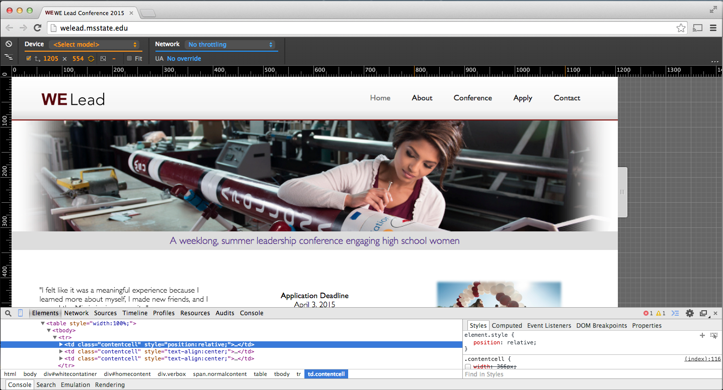
The latest
Chrome browser has an excellent tool allowing developers to write responsive-width websites. After opening the developer tools (right-click, then select "Inspect Element"), it will allow a designer to select a preset width to test based on popular devices, or drag to select a custom width and watch the content adapt. In addition, it will mark on the ruler above the page where the site is set to adapt ("breakpoints").
Caution
It is important to remember the breakpoints (the widths at which the page changes based on the max-width settings) should
not be chosen based on popular device widths, because the hardware is constantly changing. Instead, choose widths that are logical for the
content of the page.
In addition to the CSS, the following line must be included in the head section of the HTML page in order for the page to be displayed responsively on mobile devices. This tells the device's browser to style the page (set the "viewport") based off the device's width.
<meta name="viewport" content="width=device-width, initial-scale=1">
Responsive web design should be a consideration during every phase of development and not an afterthought. For existing sites, responsive design may or may not be an effective solution. Many sites are designed in such a way that do not allow responsive web design to be implemented because they use Flash heavily, or maybe the background of the page defines the columns and thus requires a fixed-width site. In these limited cases, the developer may choose to write a dedicated mobile site (maybe it pulls content from the same source as the "desktop" site). A dedicated mobile site could also be written in a very "light weight" style (e.g., limit images) to allow for fast loading times over a cell network.
Learn More
With the exponential increase in mobile traffic from smartphones, tablets, and even "phablets," responsive CSS has become a very important part of modern web design. Today, responsive CSS is not only a tool for developers but also a requirement.
Read more about
"responsive" web design, or, to learn how to build a responsive-width site, check out a
more in-depth tutorial.